
Bootstrap Estimate Evaluation
While point estimates provide a snapshot of model performance for each subgroup, they do not capture uncertainty or statistical variability. Bootstrap estimates enhance fairness auditing by enabling confidence interval computation, statistical significance testing, and disparity analysis through repeated resampling.
EquiBoots supports bootstrap-based estimation for both classification and regression tasks. This section walks through the process of generating bootstrapped group metrics, computing disparities, and performing statistical tests to assess whether observed differences are statistically significant.
1. Bootstrap Setup
Step 1.1: Instantiate EquiBoots with Bootstrapping
To begin, we instantiate the EquiBoots class with the required inputs: the
true outcome labels (y_test), predicted class labels (y_pred),
predicted probabilities (y_prob), and a DataFrame that holds sensitive
attributes like race or sex.
Note
y_pred, y_prob, y_test are defined inside the modeling generation section.
Note
For reccomended behaviour over 5000 bootstraps should be used. This ensures that we are properly estimating the normal distribution.
Bootstrapping is enabled by passing the required arguments during initialization. You must specify: - A list of random seeds for reproducibility - bootstrap_flag=True to enable resampling - The number of bootstrap iterations (num_bootstraps) - The sample size for each bootstrap - Optional settings for stratification and balancing
import numpy as np
import equiboots as eqb

int_list = np.linspace(0, 100, num=10, dtype=int).tolist()

eq2 = eqb.EquiBoots(
    y_true=y_test,
    y_pred=y_pred,
    y_prob=y_prob,
    fairness_df=fairness_df,
    fairness_vars=["race"],
    seeds=int_list,
    reference_groups=["White"],
    task="binary_classification",
    bootstrap_flag=True,
    num_bootstraps=5001,
    boot_sample_size=1000,
    group_min_size=150,
    balanced=False,
    stratify_by_outcome=False,
)
Step 1.2: Slice by Group and Compute Metrics
Once initialized, use the grouper() and slicer() methods to prepare bootstrapped samples for each subgroup:
eq2.grouper(groupings_vars=["race"])
boots_race_data = eq2.slicer("race")
Once this is done we get the metrics for each bootstrap, this will return a list of metrics for each bootstrap. This may take some time to run.
race_metrics = eq2.get_metrics(boots_race_data)
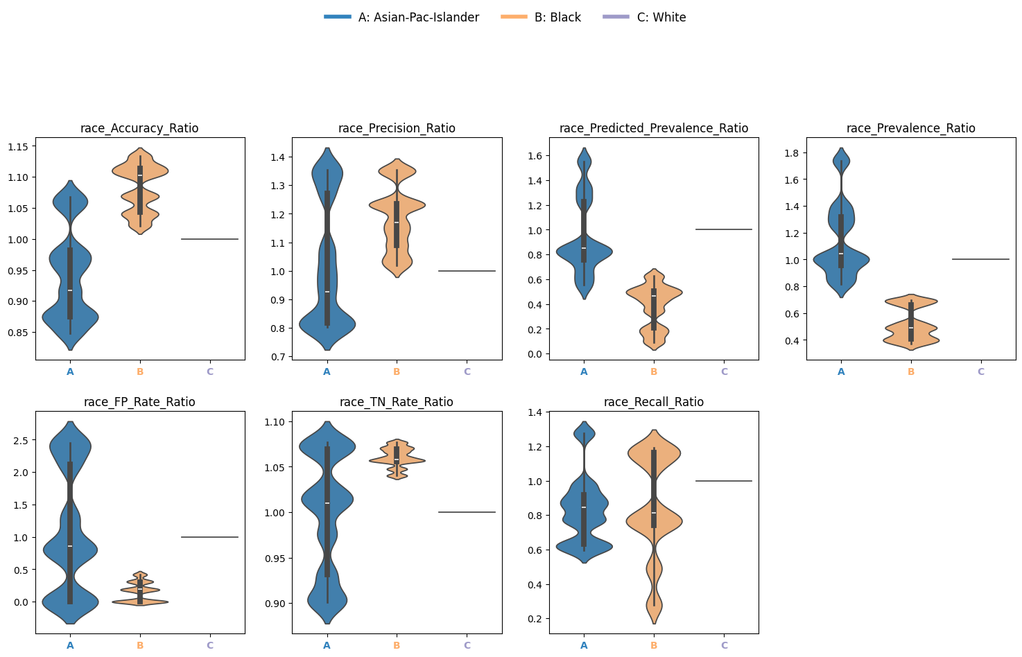
2. Disparity Analysis
Disparities quantify how model performance varies across subgroups relative to a reference. Here we look at the ratio.
Disparity Ratio: Metric ratio between a group and the reference
dispa = eq2.calculate_disparities(race_metrics, "race")
Plot Disparity Ratios
Use violin plots to visualize variability in disparity metrics across bootstrap iterations:
eqb.eq_group_metrics_plot(
    group_metrics=dispa,
    metric_cols=[
        "Accuracy_Ratio", "Precision_Ratio", "Predicted_Prevalence_Ratio",
        "Prevalence_Ratio", "FP_Rate_Ratio", "TN_Rate_Ratio", "Recall_Ratio",
    ],
    name="race",
    categories="all",
    plot_type="violinplot",
    color_by_group=True,
    strict_layout=True,
    figsize=(15, 8),
    leg_cols=7,
    max_cols=4,
)
Output
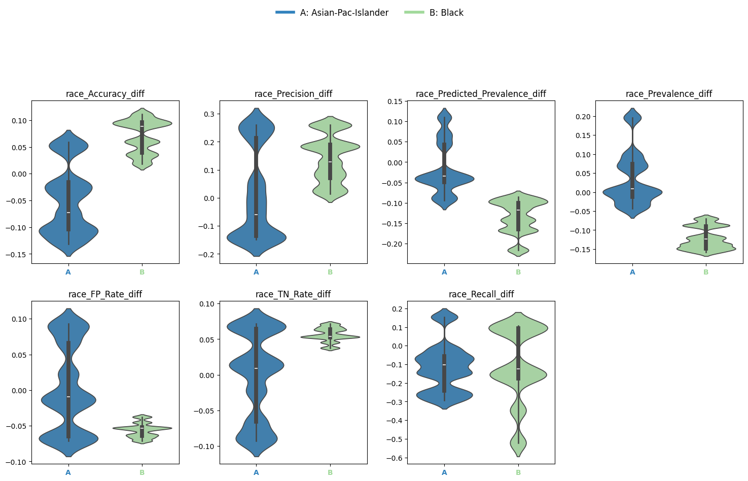
3. Metric Differences
EquiBoots also enables the user to look at the disparity in metric differences. The difference between the performance of the model for one group against the reference group.
Disparity Difference: Metric difference between a group and the reference
diffs = eq2.calculate_differences(race_metrics, "race")
eqb.eq_group_metrics_plot(
    group_metrics=diffs,
    metric_cols=[
        "Accuracy_diff", "Precision_diff", "Predicted_Prevalence_diff",
        "Prevalence_diff", "FP_Rate_diff", "TN_Rate_diff", "Recall_diff",
    ],
    name="race",
    categories="all",
    plot_type="violinplot",
    color_by_group=True,
    strict_layout=True,
    figsize=(15, 8),
    leg_cols=7,
    max_cols=4,
)
Output
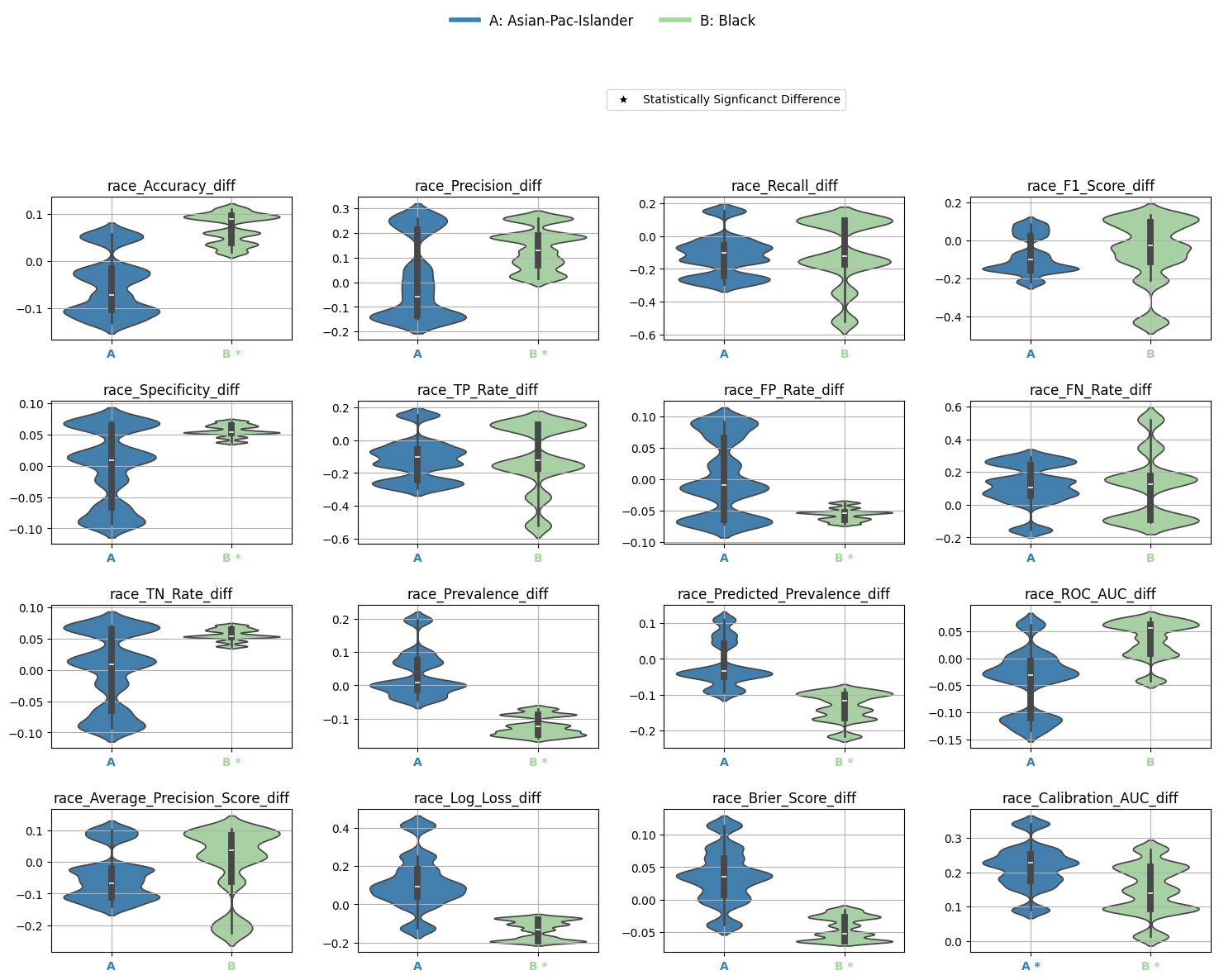
4. Statistical Significance Testing
To determine whether disparities are statistically significant, EquiBoots provides bootstrap-based hypothesis testing. This involves comparing the distribution of bootstrapped metric differences to a null distribution of no effect.
metrics_boot = [
    "Accuracy_diff", "Precision_diff", "Recall_diff", "F1_Score_diff",
    "Specificity_diff", "TP_Rate_diff", "FP_Rate_diff", "FN_Rate_diff",
    "TN_Rate_diff", "Prevalence_diff", "Predicted_Prevalence_diff",
    "ROC_AUC_diff", "Average_Precision_Score_diff", "Log_Loss_diff",
    "Brier_Score_diff", "Calibration_AUC_diff"
]

test_config = {
    "test_type": "bootstrap_test",
    "alpha": 0.05,
    "adjust_method": "bonferroni",
    "confidence_level": 0.95,
    "classification_task": "binary_classification",
    "tail_type": "two_tailed",
    "metrics": metrics_boot,
}

stat_test_results = eq2.analyze_statistical_significance(
    metric_dict=race_metrics,
    var_name="race",
    test_config=test_config,
    differences=diffs,
)
4.1: Metrics Table with Significance Annotations
You can summarize bootstrap-based statistical significance using metrics_table():
stat_metrics_table_diff = eqb.metrics_table(
    race_metrics,
    statistical_tests=stat_test_results,
    differences=diffs,
    reference_group="White",
)
Note
Asterisks (*) indicate significant omnibus test results.
Triangles (▲) indicate significant pairwise differences from the reference group.
Output
| Metric | Black | Asian-Pac-Islander |
|---|---|---|
| Accuracy_diff | 0.070 * | -0.050 |
| Precision_diff | 0.141 * | 0.016 |
| Recall_diff | -0.111 | -0.119 |
| F1_Score_diff | -0.050 | -0.080 |
| Specificity_diff | 0.056 * | -0.002 |
| TP_Rate_diff | -0.111 | -0.119 |
| FP_Rate_diff | -0.056 * | 0.002 |
| FN_Rate_diff | 0.111 | 0.119 |
| TN_Rate_diff | 0.056 * | -0.002 |
| Prevalence_diff | -0.122 * | 0.035 |
| Predicted_Prevalence_diff | -0.133 * | -0.016 |
| ROC_AUC_diff | 0.035 | -0.041 |
| Average_Precision_Score_diff | -0.005 | -0.044 |
| Log_Loss_diff | -0.131 * | 0.113 |
| Brier_Score_diff | -0.043 * | 0.036 |
| Calibration_AUC_diff | 0.148 * | 0.215 * |
4.2: Visualize Differences with Significance
Finally, plot the statistically tested metric differences:
eqb.eq_group_metrics_plot(
    group_metrics=diffs,
    metric_cols=metrics_boot,
    name="race",
    categories="all",
    figsize=(20, 10),
    plot_type="violinplot",
    color_by_group=True,
    show_grid=True,
    max_cols=6,
    strict_layout=True,
    show_pass_fail=False,
    statistical_tests=stat_test_results,
)
Output
Bootstrapped Group Curve Plots
- eq_plot_bootstrapped_group_curves(boot_sliced_data, curve_type='roc', common_grid=np.linspace(0, 1, 100), bar_every=10, n_bins=10, line_kwgs=None, title='Bootstrapped Curve by Group', filename='bootstrapped_curve', save_path=None, figsize=(8, 6), dpi=100, subplots=False, n_cols=2, n_rows=None, group=None, color_by_group=True, exclude_groups=0, show_grid=True, y_lim=None)
Plots bootstrapped ROC, precision-recall, or calibration curves by group. This function takes a list of bootstrapped group-level datasets and computes uncertainty bands for each curve using interpolation over a shared x-axis grid. Results can be rendered in overlay or subplot formats, with optional gridlines and curve-specific annotations (e.g., AUROC, AUCPR, or Brier score).
- Parameters:
boot_sliced_data (list[dict[str, dict[str, np.ndarray]]]) – A list of bootstrap iterations, each mapping group name to ‘y_true’ and ‘y_prob’ arrays.
curve_type (str) – Type of curve to plot: ‘roc’, ‘pr’, or ‘calibration’.
common_grid (np.ndarray) – Shared x-axis points used to interpolate all curves for consistency.
bar_every (int) – Number of points between vertical error bars on the bootstrapped curve.
n_bins (int) – Number of bins for calibration plots.
line_kwgs (dict[str, Any] or None) – Optional style parameters for the diagonal or baseline reference line.
title (str) – Title of the entire plot.
filename (str) – Filename (without extension) used when saving the plot.
save_path (str or None) – Directory path to save the figure. If None, the plot is displayed instead.
figsize (tuple[float, float]) – Size of the figure as a (width, height) tuple in inches.
dpi (int) – Dots-per-inch resolution of the figure.
subplots (bool) – Whether to show each group’s curve in a separate subplot.
n_cols (int) – Number of columns in the subplot grid.
n_rows (int or None) – Number of rows in the subplot grid. Auto-calculated if None.
group (str or None) – Optional name of a single group to plot instead of all groups.
color_by_group (bool) – Whether to assign colors by group identity.
exclude_groups (int | str | list[str] | set[str]) – Groups to exclude from the plot, either by name or by minimum sample size.
show_grid (bool) – Whether to display gridlines on each plot.
y_lim (tuple[float, float] or None) – Optional y-axis limits (min, max) to enforce on the plots.
ROC AUC Curves
The example below shows bootstrapped ROC curves stratified by race group. Each curve reflects the average ROC performance across resampled iterations, with vertical error bars illustrating variability.
By toggling the subplots argument, the visualization can either overlay all group curves
on a single axis (subplots=False) or display each group in its own panel (subplots=True),
depending on the desired layout.
Example 1 (Overlayed Curves with Error Bars)
eqb.eq_plot_bootstrapped_group_curves(
    boot_sliced_data=boots_race_data,
    curve_type="roc",
    title="Bootstrapped ROC Curve by Race",
    bar_every=100,
    dpi=100,
    n_bins=10,
    figsize=(6, 6),
    color_by_group=True,
)
Output
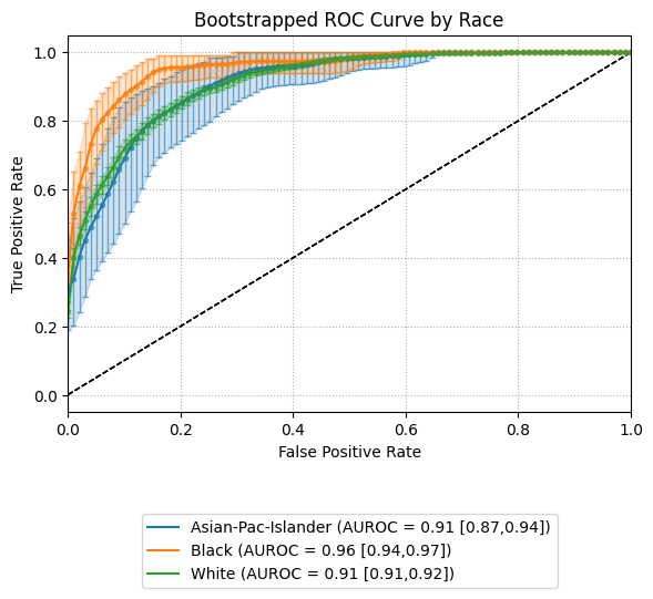
This view helps quantify variability in model performance across subpopulations.
Overlaying curves in a single plot (subplots=False) makes it easy to compare
uncertainty bands side by side. Groups with insufficient data or minimal representation
can be excluded using exclude_groups.
Example 2 (subplots=True)
eqb.eq_plot_bootstrapped_group_curves(
    boot_sliced_data=boots_race_data,
    curve_type="roc",
    title="Bootstrapped ROC Curve by Race",
    bar_every=100,
    subplots=True,
    dpi=100,
    n_bins=10,
    figsize=(6, 6),
    color_by_group=True,
)
Output
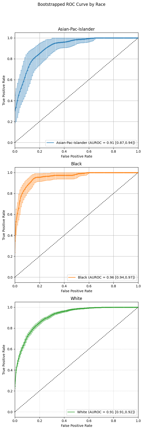
This multi‐panel layout makes side-by-side comparison of each group’s uncertainty bands straightforward.
eqb.eq_plot_bootstrapped_group_curves(
    boot_sliced_data=boots_race_data,
    curve_type="pr",
    title="Bootstrapped PR Curve by Race",
    filename="boot_roc_race",
    save_path="./images",
    subplots=True,
    bar_every=100,
    # n_rows=1,
    n_cols=1,
    dpi=100,
    n_bins=10,
    figsize=(6, 6),
    color_by_group=True,
)
Precision-Recall Curves
The example below presents bootstrapped precision-recall (PR) curves grouped by race. Each curve illustrates the average precision-recall relationship across bootstrapped samples, with vertical error bars indicating the variability at select recall thresholds.
As with ROC curves, setting subplots=False overlays all groups in a single plot,
allowing for compact comparison. Alternatively, setting subplots=True creates individual panels
for each group to better visualize variations in precision across recall levels.
eqb.eq_plot_bootstrapped_group_curves(
    boot_sliced_data=boots_race_data,
    curve_type="pr",
    title="Bootstrapped PR Curve by Race",
    subplots=True,
    bar_every=100,
    n_cols=1,
    dpi=100,
    n_bins=10,
    figsize=(6, 6),
    color_by_group=True,
)
Output
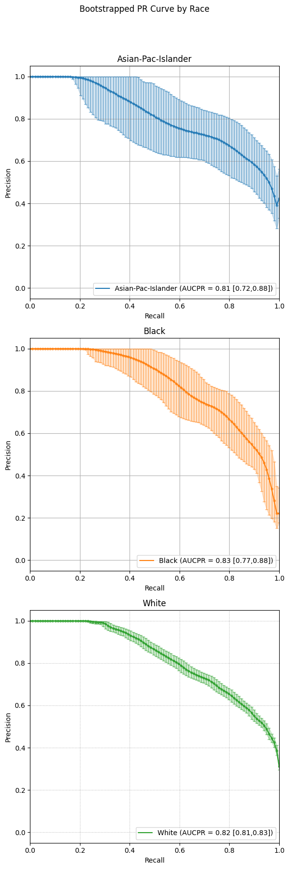
Subplot mode offers a cleaner side-by-side comparison of each group’s bootstrapped precision-recall behavior, making small differences in model performance easier to interpret.
Calibration Curves
The following example visualizes bootstrapped calibration curves grouped by race. Each curve reflects the average alignment between predicted probabilities and observed outcomes, aggregated over multiple resampled datasets. Vertical bars show variability in the calibration estimate at evenly spaced probability intervals.
As with ROC and PR plots, subplots=False will overlay all group curves on one axis,
while subplots=True generates a separate panel for each group.
Example 1 (Overlayed Calibration Curves with Error Bars)
eqb.eq_plot_bootstrapped_group_curves(
    boot_sliced_data=boots_race_data,
    curve_type="calibration",
    title="Bootstrapped Calibration Curve by Race",
    subplots=True,
    bar_every=10,
    dpi=100,
    n_bins=10,
    figsize=(6, 6),
    color_by_group=True,
)
Output
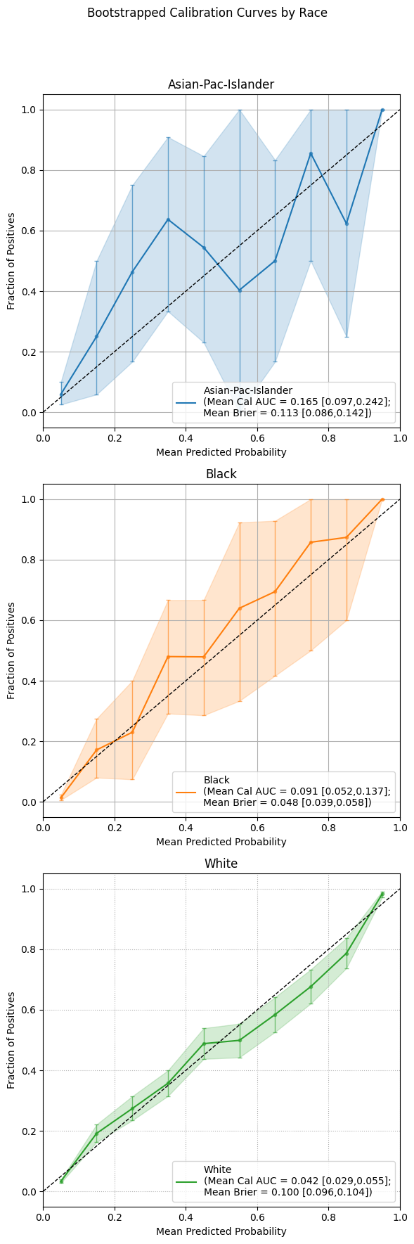
Using subplots offers a focused view of calibration accuracy for each group, allowing nuanced inspection of where the model’s confidence aligns or diverges from observed outcomes.
Summary
Bootstrapping provides a rigorous and interpretable framework for evaluating fairness by estimating uncertainty in performance metrics, computing disparities, and identifying statistically significant differences between groups.
Use EquiBoots to support robust fairness audits that go beyond simple point comparisons and account for sampling variability and multiple comparisons.