
Point Estimate Evaluation
After training a model and preparing predictions, EquiBoots can be used to evaluate how your model performs across different demographic groups. The most basic step in this process is calculating point estimates. These are performance metrics for each group without resampling or bootstrapping.
EquiBoots supports the computation of group-specific and overall point estimates for performance metrics across classification and regression tasks. These estimates form the basis for fairness auditing by revealing how models perform across different subpopulations or sensitive attributes.
This section demonstrates how to compute group-wise performance metrics using model outputs and fairness variables from the Adult Income dataset [1]. For bootstrapped confidence intervals, refer to the bootstrapped metrics evaluation section.
Supported Metrics
For classification tasks, the following metrics are supported:
Accuracy, Precision, Recall, F1-score
AUROC, AUPRC (for probabilistic models)
Calibration Area Under The Curve
Log Loss, Brier Score
For regression tasks:
\(R^2, MAE, MSE, RMSE\)
Group-based residual plots
Initial Set-up
Step 1: Import and Initialize EquiBoots
To begin, we instantiate the EquiBoots class with the required inputs: the
true outcome labels (y_test), predicted class labels (y_pred),
predicted probabilities (y_prob), and a DataFrame that holds sensitive
attributes like race or sex.
Note
y_pred, y_prob, y_test are defined inside the modeling generation section.
Once initialized, EquiBoots uses its internal grouping mechanism to enable
fairness auditing by slicing the dataset into mutually exclusive subgroups based
on each fairness variable. This slicing is a prerequisite for evaluating model
behavior across subpopulations.
The grouper method stores index-level membership for each group, ensuring
that only groups meeting a minimum sample size are considered. This prevents
unstable or misleading metric calculations. Once sliced, we call slicer
to extract the y_true, y_pred, and y_prob values corresponding to
each group. Finally, get_metrics is used to compute core performance metrics
for each subgroup.
import equiboots as eqb

# Create fairness DataFrame
fairness_df = X_test[['race', 'sex']].reset_index()

eq = eqb.EquiBoots(
    y_true=y_test,
    y_prob=y_prob,
    y_pred=y_pred,
    fairness_df=fairness_df,
    fairness_vars=["race", "sex"],
)
Step 2: Slice Groups and Compute Point Estimates
Once the class is initialized, we slice the dataset into subgroups and compute performance metrics for each group. This step is critical for assessing whether model performance varies by group.
import equiboots as eqb

sliced_race_data = eq.slicer("race")
race_metrics = eq.get_metrics(sliced_race_data)

sliced_sex_data = eq.slicer("sex")
sex_metrics = eq.get_metrics(sliced_sex_data)
Each output is a dictionary of group names (e.g., 'Male', 'Female', 'Asian', 'White')
mapped to performance metrics such as accuracy, AUROC, precision, or RMSE, depending on the task type.
Metrics DataFrame
Because these dictionaries can contain many entries and nested metric structures,
we avoid printing them directly in documentation. Instead, we use the metrics_dataframe()
function to transform the dictionary into a clean, filterable DataFrame.
To keep the table concise and relevant, we subset the DataFrame to include only a selected set of metrics:
Accuracy
Precision
Recall
F1 Score
Specificity
TP Rate
Prevalence
Average Precision Score
Calibration AUC
- metrics_dataframe(metrics_data)
Transforms a list of grouped metric dictionaries into a single flat DataFrame.
- Parameters:
metrics_data (List[Dict[str, Dict[str, float]]]) – A list of dictionaries, where each dictionary maps a group name to its associated performance metrics.
- Returns:
A tidy DataFrame with one row per group and one column per metric. The group names are stored in the
attribute_valuecolumn.- Return type:
pd.DataFrame
This function is used after computing metrics using
eqb.get_metrics().It flattens nested group-wise dictionaries into a readable table, enabling easy subsetting, filtering, and export.
Common use cases include displaying fairness-related metrics such as Accuracy, Precision, Recall, Specificity, Calibration AUC, and others across different sensitive attribute groups (e.g., race, sex).
The metrics_dataframe() function simplifies post-processing and reporting by converting the raw output of group-level metrics into a tabular format. Each row corresponds to a demographic group, and each column represents a different metric.
Below is an example of how this function is used in practice to format metrics by race:
import equiboots as eqb

race_metrics_df = eqb.metrics_dataframe(metrics_data=race_metrics)
race_metrics_df = race_metrics_df[
    [
        "attribute_value",
        "Accuracy",
        "Precision",
        "Recall",
        "F1 Score",
        "Specificity",
        "TP Rate",
        "Prevalence",
        "Average Precision Score",
        "Calibration AUC",
    ]
]
## round to 3 decimal places for readability
round(race_metrics_df, 3)
This yields a structured and readable table of group-level performance for use in reporting or further analysis.
Output
| attribute_value | Accuracy | Precision | Recall | F1 Score | Specificity | TP Rate | Prevalence | Calibration AUC | |
|---|---|---|---|---|---|---|---|---|---|
| 0 | White | 0.853 | 0.761 | 0.638 | 0.694 | 0.929 | 0.638 | 0.262 | 0.040 |
| 1 | Black | 0.931 | 0.861 | 0.549 | 0.670 | 0.987 | 0.549 | 0.128 | 0.054 |
| 2 | Asian-Pac-Islander | 0.826 | 0.760 | 0.543 | 0.633 | 0.934 | 0.543 | 0.277 | 0.140 |
| 3 | Amer-Indian-Eskimo | 0.879 | 0.444 | 0.364 | 0.400 | 0.943 | 0.364 | 0.111 | 0.323 |
| 4 | Other | 0.958 | 1.000 | 0.500 | 0.667 | 1.000 | 0.500 | 0.083 | 0.277 |
Statistical Tests
After computing point estimates for different demographic groups, we may want to assess whether observed differences in model performance are statistically significant. This is particularly important when determining if disparities are due to random variation or reflect systematic bias.
EquiBoots provides a method to conduct hypothesis testing across group-level metrics.
The analyze_statistical_significance function performs appropriate statistical
tests—such as Chi-square tests for classification tasks—while supporting multiple
comparison adjustments.
- analyze_statistical_significance(metric_dict, var_name, test_config, differences=None)
Performs statistical significance testing of metric differences between groups.
This method compares model performance across subgroups (e.g., race, sex) to determine whether the differences in metrics (e.g., accuracy, F1 score) are statistically significant. It supports multiple test types and adjustment methods for robust group-level comparison.
- Parameters:
metric_dict (dict) – Dictionary of metrics returned by
get_metrics(), where each key is a group name and values are metric dictionaries.var_name (str) – The name of the sensitive attribute or grouping variable (e.g.,
"race","sex").test_config (dict) –
Configuration dictionary defining how the statistical test is performed. The following keys are supported:
test_type: Type of test to use (e.g.,"chi_square","bootstrap").alpha: Significance threshold (default: 0.05).adjust_method: Correction method for multiple comparisons (e.g.,"bonferroni","fdr_bh","holm", or"none").confidence_level: Confidence level used to compute intervals (e.g.,0.95).classification_task: Specify if the model task is"binary_classification"or"multiclass_classification".
differences (list, optional) – Optional precomputed list of raw metric differences (default is
None; typically not required).
- Returns:
A nested dictionary containing statistical test results for each metric, with each value being a
StatTestResultobject that includes:test statistic
raw and adjusted p-values
confidence intervals
significance flags (
True/False)effect sizes (e.g., Cohen’s d, rank-biserial correlation)
- Return type:
Dict[str, Dict[str, StatTestResult]]
- Raises:
ValueError – If
test_configis not provided or isNone.
This function returns a dictionary where each key is a metric name and the
corresponding value is another dictionary mapping each group to its StatTestResult.
Example
The following example demonstrates how to configure and run these tests on
performance metrics for the race and sex subgroups:
test_config = {
    "test_type": "chi_square",
    "alpha": 0.05,
    "adjust_method": "bonferroni",
    "confidence_level": 0.95,
    "classification_task": "binary_classification",
}
stat_test_results_race = eq.analyze_statistical_significance(
    race_metrics, "race", test_config
)

stat_test_results_sex = eq.analyze_statistical_significance(
    sex_metrics, "sex", test_config
)

overall_stat_results = {
    "sex": stat_test_results_sex,
    "race": stat_test_results_race,
}
Statistical Significance Plots
EquiBoots supports formal statistical testing to assess whether differences in performance metrics across demographic groups are statistically significant.
When auditing models for fairness, it’s important not just to observe differences in metrics like accuracy or recall, but to determine whether these differences are statistically significant. EquiBoots provides built-in support for this analysis via omnibus and pairwise statistical tests.
Test Setup
EquiBoots uses chi-square tests to evaluate:
Whether overall performance disparities across groups are significant (omnibus test).
If so, which specific groups significantly differ from the reference (pairwise tests).
Reference groups for each fairness variable can be set manually during class initialization using the
reference_groupsparameter:eq = EquiBoots( y_true=..., y_pred=..., y_prob=..., fairness_df=..., fairness_vars=["race", "sex"], reference_groups=["white", "female"] )
Group Metrics Point Plot
- eq_group_metrics_point_plot(group_metrics, metric_cols, category_names, include_legend=True, cmap='tab20c', save_path=None, filename='Point_Disparity_Metrics', strict_layout=True, figsize=None, show_grid=True, plot_thresholds=(0.0, 2.0), show_pass_fail=False, y_lim=None, leg_cols=3, raw_metrics=False, statistical_tests=None, show_reference=True, **plot_kwargs)
Creates a grid of point plots for visualizing metric values (or disparities) across sensitive groups and multiple categories (e.g., race, sex). Each subplot corresponds to one (metric, category) combination, and groups are colored or flagged based on significance or pass/fail criteria.
- Parameters:
group_metrics (list[dict[str, dict[str, float]]]) – A list of dictionaries where each dictionary maps group names to their respective metric values for one category.
metric_cols (list[str]) – List of metric names to plot (one per row).
category_names (list[str]) – Names of each category corresponding to group_metrics (one per column).
include_legend (bool) – Whether to display the legend on the plot.
cmap (str) – Colormap used to distinguish groups.
save_path (str or None) – Directory path where the plot should be saved. If None, the plot is shown.
filename (str) – Filename for saving the plot (without extension).
strict_layout (bool) – Whether to apply tight layout spacing.
figsize (tuple[float, float] or None) – Tuple for figure size (width, height).
show_grid (bool) – Toggle for showing gridlines on plots.
plot_thresholds (tuple[float, float]) – A tuple (lower, upper) for pass/fail thresholds.
show_pass_fail (bool) – Whether to color points based on pass/fail evaluation rather than group color.
y_lim (tuple[float, float] or None) – Y-axis limits as a (min, max) tuple.
leg_cols (int) – Number of columns in the group legend.
raw_metrics (bool) – Whether the input metrics are raw values (True) or already calculated disparities (False).
statistical_tests (dict or None) – Dictionary mapping categories to their statistical test results, used for annotating groups with significance markers.
show_reference (bool) – Whether to plot the horizontal reference line (e.g., y=1 for ratios).
plot_kwargs (dict[str, Union[str, float]]) – Additional keyword arguments passed to sns.scatterplot.
Once tests are computed, the eq_group_metrics_point_plot function can
visualize point estimates along with statistical significance annotations:
eqb.eq_group_metrics_point_plot(
    group_metrics=[race_metrics, sex_metrics],
    metric_cols=[
        "Accuracy",
        "Precision",
        "Recall",
    ],
    category_names=["race", "sex"],
    figsize=(6, 8),
    include_legend=True,
    raw_metrics=True,
    show_grid=True,
    y_lim=(0, 1.1),
    statistical_tests=overall_stat_results,
    show_pass_fail=False,
    show_reference=False,
    y_lims = {(0,0): (0.70, 1.0), (0,1): (0.70, 1.0)}
)
Output
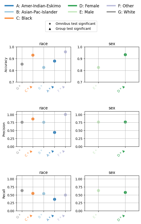
The chart above summarizes how model performance varies across race and sex groups for three key metrics: Accuracy, Precision, and Recall.
Each subplot corresponds to a single metric, plotted separately for race (left) and sex (right).
Here’s how to read the plot:
Each point shows the average metric score for a demographic group.
Letters (A–G) label the groups (e.g., A = Amer-Indian-Eskimo, B = Asian-Pac-Islander), with the full mapping provided in the legend.
The star symbol (★) below a group axis label indicates that the omnibus test for the corresponding fairness attribute (e.g., race or sex) was statistically significant overall.
The triangle symbol (▲) denotes groups that differ significantly from the reference group, as determined by pairwise statistical tests (e.g., Bonferroni-adjusted chi-square).
Color-coding helps distinguish categories and corresponds to the legend at the top.
This visualization reveals whether disparities exist not only numerically, but also statistically, helping validate whether observed group-level differences are likely due to bias or simply random variation.
Statistical Metrics table
Once statistical tests have been performed, we can summarize the results in a structured table that shows:
The performance metrics for each group.
Whether the omnibus test detected any significant overall differences.
Which individual groups differ significantly from the reference group.
This is done using the metrics_table function from EquiBoots, which takes in group metrics, test results, and the name of the reference group:
- metrics_table(metrics, statistical_tests=None, differences=None, reference_group=None)
- Parameters:
metrics (dict or list) – A dictionary or list of dictionaries containing metric results per group. This can either be point estimate output from
get_metricsor bootstrapped results.statistical_tests (dict, optional) – Output from
analyze_statistical_significancecontaining omnibus and pairwise test results. If provided, annotations will be added to the output table to reflect significance.differences (list of dict, optional) – A list of bootstrapped difference dictionaries returned from
calculate_differences. If provided, the function will average these differences and annotate the results if significant.reference_group (str, optional) – Name of the reference group used in pairwise comparisons. Only needed if displaying pairwise significance for bootstrapped differences.
- Returns:
A pandas DataFrame where rows are metric names and columns are group names. If
statistical_testsis provided: - Omnibus test significance is marked with an asterisk (*) next to column names. - Pairwise group significance (vs. reference) is marked with a triangle (▲).- Return type:
pd.DataFrame
Note
The function supports both point estimates and bootstrapped results.
When using bootstrapped differences, it computes the mean difference for each metric across iterations.
Automatically drops less commonly visualized metrics like Brier Score, Log Loss, and Prevalence for clarity if significance annotations are active.
stat_metrics_table_point = metrics_table(
    race_metrics,
    statistical_tests=stat_test_results_race,
    reference_group="White",
)
You can then display the table as follows:
## Table with metrics per group and statistical significance shown on
## columns for omnibus and/or pairwise

stat_metrics_table_point
The resulting table displays one row per group and one column per metric. Symbols like * and ▲ appear in the appropriate cells to indicate significance:
★ marks metrics where the omnibus test found significant variation across all groups.
▲ marks metrics where a specific group differs significantly from the reference group.
This format provides a concise, interpretable snapshot of where disparities are statistically supported in your model outputs.
| White * | Black * ▲ | Asian-Pac-Islander * | Amer-Indian-Eskimo * ▲ | Other * ▲ | |
|---|---|---|---|---|---|
| Accuracy | 0.853 | 0.931 | 0.826 | 0.879 | 0.958 |
| Precision | 0.761 | 0.861 | 0.76 | 0.444 | 1 |
| Recall | 0.638 | 0.549 | 0.543 | 0.364 | 0.5 |
| F1 Score | 0.694 | 0.67 | 0.633 | 0.4 | 0.667 |
| Specificity | 0.929 | 0.987 | 0.934 | 0.943 | 1 |
| TP Rate | 0.638 | 0.549 | 0.543 | 0.364 | 0.5 |
| FP Rate | 0.071 | 0.013 | 0.066 | 0.057 | 0 |
| FN Rate | 0.362 | 0.451 | 0.457 | 0.636 | 0.5 |
| TN Rate | 0.929 | 0.987 | 0.934 | 0.943 | 1 |
| TP | 1375 | 62 | 38 | 4 | 3 |
| FP | 432 | 10 | 12 | 5 | 0 |
| FN | 780 | 51 | 32 | 7 | 3 |
| TN | 5631 | 760 | 171 | 83 | 66 |
| Predicted Prevalence | 0.22 | 0.082 | 0.198 | 0.091 | 0.042 |
Group Curve Plots
To help visualize how model performance varies across sensitive groups, EquiBoots provides a convenient plotting function for generating ROC, Precision-Recall, and Calibration curves by subgroup. These visualizations are essential for identifying disparities in predictive behavior and diagnosing potential fairness issues.
The function below allows you to create either overlaid or per-group subplots, customize curve aesthetics, exclude small or irrelevant groups, and optionally save plots for reporting.
After slicing your data using the slicer() method and organizing group-specific
y_true and y_prob values, you can pass the resulting dictionary to
eq_plot_group_curves to generate interpretable, publication-ready visuals.
- eq_plot_group_curves(data, curve_type='roc', n_bins=10, decimal_places=2, curve_kwgs=None, line_kwgs=None, title='Curve by Group', filename='group', save_path=None, figsize=(8, 6), dpi=100, subplots=False, n_cols=2, n_rows=None, group=None, color_by_group=True, exclude_groups=0, show_grid=True, lowess=0, shade_area=False)
Plots ROC, Precision-Recall, or Calibration curves by demographic group.
- Parameters:
data (Dict[str, Dict[str, np.ndarray]]) – Dictionary mapping group names to dictionaries containing
y_trueandy_probarrays. This is typically the output of theslicermethod from the EquiBoots class.curve_type (str) – Type of curve to plot. Options are
"roc","pr", or"calibration".n_bins (int, optional) – Number of bins to use for calibration curves. Ignored for ROC and PR.
decimal_places (int, optional) – Number of decimal places to show in curve labels (e.g., for AUC or Brier scores).
curve_kwgs (Dict[str, Dict[str, Union[str, float]]], optional) – Optional dictionary of plotting keyword arguments per group, allowing customization of curve aesthetics.
line_kwgs (Dict[str, Union[str, float]], optional) – Optional keyword arguments for reference lines (e.g., the diagonal line in ROC).
title (str, optional) – Title of the entire figure.
filename (str, optional) – Output filename prefix, used if saving plots.
save_path (str, optional) – If specified, saves the figure as PNG in the directory provided.
figsize (Tuple[float, float], optional) – Tuple specifying the figure size in inches (width, height).
dpi (int, optional) – Resolution of the plot in dots per inch.
subplots (bool, optional) – Whether to generate a subplot per group (if False, all curves are plotted on one axis).
n_cols (int, optional) – Number of columns to use in subplot grid.
n_rows (int, optional) – Number of subplot rows. If
None, this is inferred based on the number of groups.group (str, optional) – If set, plots only the specified group.
color_by_group (bool, optional) – If True, uses different colors for each group; otherwise, all curves are plotted in blue.
exclude_groups (Union[int, str, list, set], optional) – Optionally exclude specific groups by name or minimum sample size.
show_grid (bool, optional) – Whether to show background grid in the plot.
lowess (float, optional) – Optional smoothing factor (between 0 and 1) applied to calibration curves.
shade_area (bool, optional) – Whether to shade the area under the curve (useful for ROC and PR).
- Returns:
None. The plot is displayed or saved based on the
save_pathargument.- Return type:
None
Notes
Overlay Mode: When
subplots=False, all group curves are shown in a single plot for easy comparison.Subplot Mode: When
subplots=True, each group is plotted in its own axis using a grid layout.Single Group Mode: You can pass a specific
groupto plot only one group separately.Curve Labels: Each curve is labeled with the metric value, such as AUROC or Brier Score.
Reference Lines: For ROC and calibration curves, a diagonal reference line is included unless overridden via
line_kwgs.
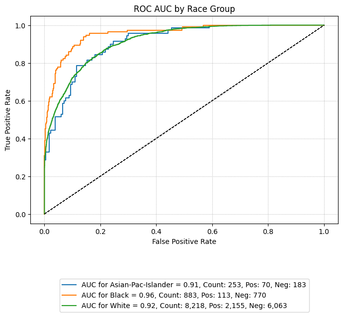
ROC AUC Curve
The following code generates an ROC AUC curve comparing performance across racial groups. This visualization helps assess whether the model maintains similar true positive and false positive trade-offs across subpopulations.
By setting subplots=False, the curves for each group are overlaid on a single plot,
making disparities visually apparent. Groups with insufficient sample sizes or minimal
representation can be excluded using the exclude_groups parameter, as shown below.
eqb.eq_plot_group_curves(
    sliced_race_data,
    curve_type="roc",
    title="ROC AUC by Race Group",
    figsize=(7, 7),
    decimal_places=2,
    subplots=False,
    exclude_groups=["Amer-Indian-Eskimo", "Other"]
)
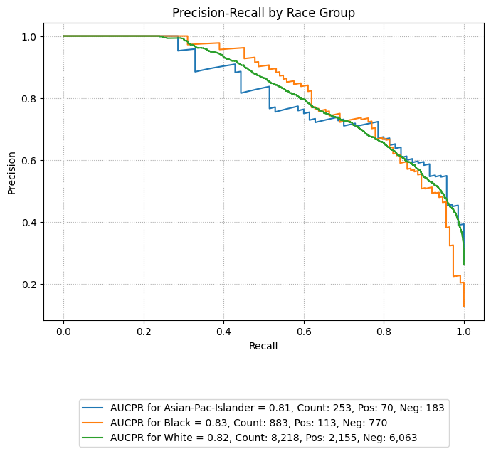
Precision-Recall Curves
eqb.eq_plot_group_curves(
    sliced_race_data,
    curve_type="pr",
    subplots=False,
    figsize=(7, 7),
    title="Precision-Recall by Race Group",
    exclude_groups=["Amer-Indian-Eskimo", "Other"]
)
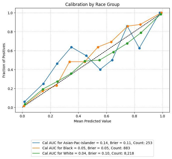
Calibration Plots
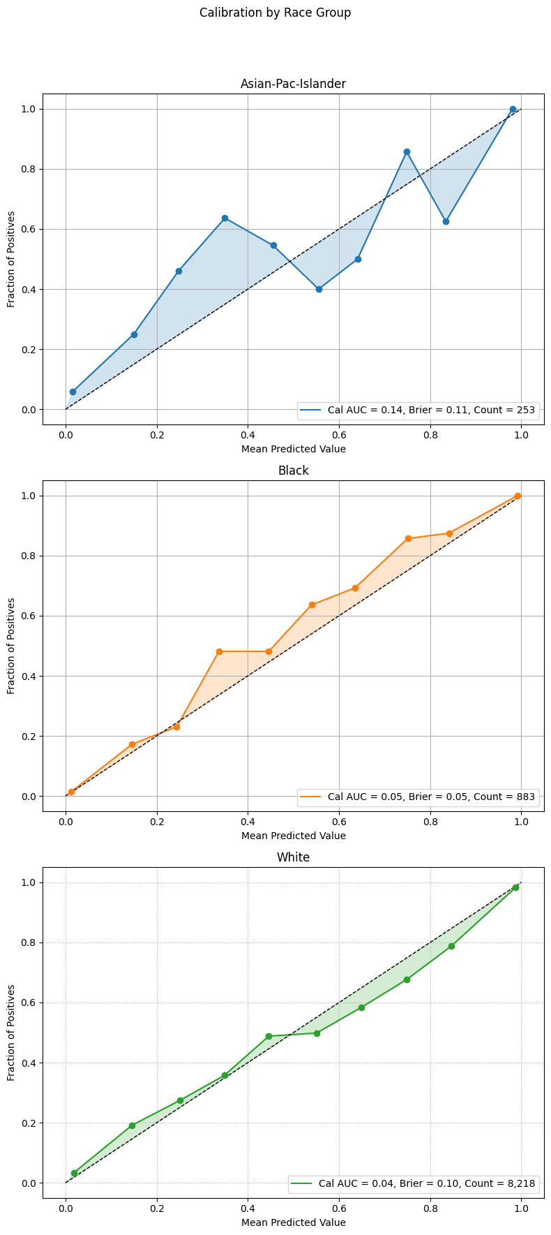
Calibration plots compare predicted probabilities to actual outcomes, showing how well the model’s confidence aligns with observed frequencies. A perfectly calibrated model will have a curve that closely follows the diagonal reference line.
The example below overlays calibration curves by racial group, using the same sliced data. Groups with low representation are excluded to ensure stable and interpretable plots.
For additional context on the geometric intuition behind calibration curves, including how the area between the observed curve and the ideal diagonal can be interpreted, see the Mathematical Framework section. That section illustrates how integration under the curve provides a mathematical view of calibration performance.
Example 1 (Calibration Overlay)
eqb.eq_plot_group_curves(
    sliced_race_data,
    curve_type="calibration",
    title="Calibration by Race Group",
    figsize=(7, 7),
    decimal_places=2,
    subplots=False,
    exclude_groups=["Amer-Indian-Eskimo", "Other"]
)
Example 2 (Calibration Subplots)
This example builds on the previous one by showing individual calibration curves in separate subplots and enabling shaded areas beneath the curves. This layout improves visual clarity, especially when comparing many groups or when the overlaid version appears cluttered.
Setting shade_area=True fills the area under each calibration curve.
Subplots also help isolate each group’s performance,
allowing easier inspection of group-specific trends.
eqb.eq_plot_group_curves(
    sliced_race_data,
    curve_type="calibration",
    title="Calibration by Race Group",
    figsize=(7, 7),
    decimal_places=2,
    subplots=True,
    shade_area=True,
    n_cols=3,
    exclude_groups=["Amer-Indian-Eskimo", "Other"]
)
Example 3 (LOWESS Calibration)
This example demonstrates the use of Locally Weighted Scatterplot Smoothing (LOWESS) to fit a locally adaptive curve for calibration. This technique is helpful when calibration is non-linear or when jagged curves result from small group sizes or class imbalance.
Note
Enable LOWESS smoothing by setting the lowess parameter to a float between
0 and 1, which controls the smoothing span. Additional styling can be applied
via lowess_kwargs.
eqb.eq_plot_group_curves(
    sliced_race_data,
    curve_type="calibration",
    title="Calibration by Race Group (LOWESS Smoothing)",
    figsize=(7, 7),
    decimal_places=2,
    subplots=True,
    lowess=0.6,
    lowess_kwargs={"linestyle": "--", "linewidth": 2, "alpha": 0.6},
    n_cols=3,
    exclude_groups=["Amer-Indian-Eskimo", "Other"]
)
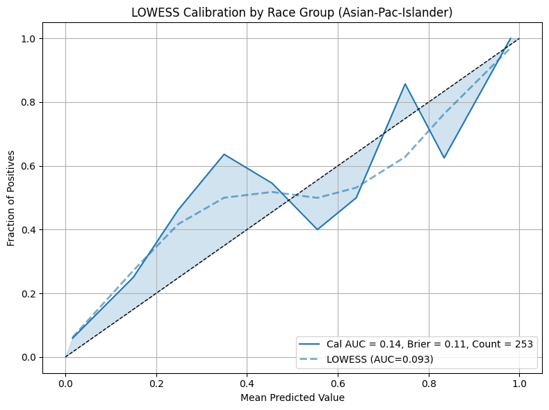
LOWESS produces smoother and more flexible calibration curves compared to binning. It is particularly useful for identifying subtle trends in over or under-confidence across different segments of the population.